Happy Friday, picnickers!
This week started off on a bittersweet personal note - I have parted ways with AWS, and am looking for my next UX role (hit me up if you’re hiring in NYC or remote!).
As the job postings blur together before my eyes, an interesting trend emerges above all others. The hiring manager of 2025 is still interested in visual excellence, raising the bar on craft, and high-fidelity deliverables (the 2020s version of the 2010s’ “look and feel”) but there’s something else too.
Compelling storytelling to align stakeholders. Partnering closely with cross-functional teams. Bringing people on the journey with you, explaining your decisions, speaking to trade-offs.
Design teams that left defining “valuable” to PMs have been burnt too many times by inert “deliverables” that had no impact, or worse - misled stakeholders and left Design holding the hot potato. We are returning to an understanding that visuals are not design outcomes, but merely tools that need to be used correctly to create desired impact not just on a user, but within our orgs.
The Timeline
Scott Berkun puts this sentiment very well: “You must be a master of idea diffusion, not just idea creation.” The visual design artifact is one of the tools we can use for that, but it’s not the end goal. The end goal is to change minds within the organization.
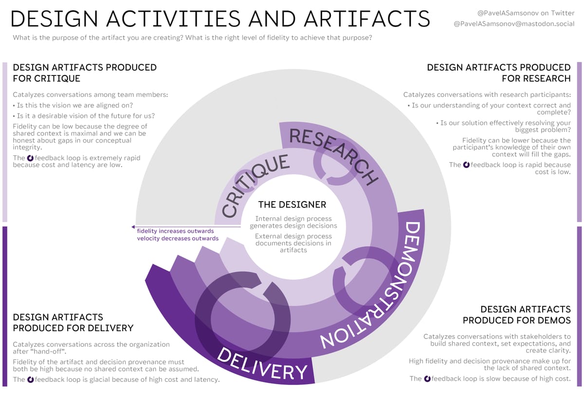
One of my old diagrams that deals with exactly this matter resurfaced at Helio earlier this week. It was originally prompted by a common misunderstanding about Lean UX that unfortunately persists today - the idea that “less deliverables” means that we can skip directly to high fidelity.

But that’s the opposite of lean. High fidelity artifacts are good for one thing — hand-off to an audience that has no shared context — but Lean is all about building that context together, or in other words, diffusing ideas. When you have established that shared context, high fidelity only means slower feedback cycles - and even in 1968 we knew that feedback is the key to everything when it comes to software.
Reading Material
Incidentally, the newly viral CIA field guide to sabotage contains a lot of great suggestions for interrupting feedback loops.

My train of thought this week echoes a lovely piece by Alan Kay from 1995 about the power of stories to hijack logical thinking. Normally designers see themselves as the storytellers - we talk about narratives like they are our friends - but just as often, outdated narratives stand in the way of proper data-driven design. Design outputs are memetic because they have to be, or they are trampled by the predominant memes of your organization, and you will learn nothing.
One meme that will not die is the notion of the “expert user.” Users who are experts surely do exist, but this persona is usually summoned for the purpose of dismissing design. “Our users are experts so they do not need it to be usable.” This 2016 NN/g piece is a good reminder of the truth: no, your user is probably not an expert.
Across 33 rich countries, only 5% of the population has high computer-related abilities, and only a third of people can complete medium-complexity tasks.
Diagram of the Week
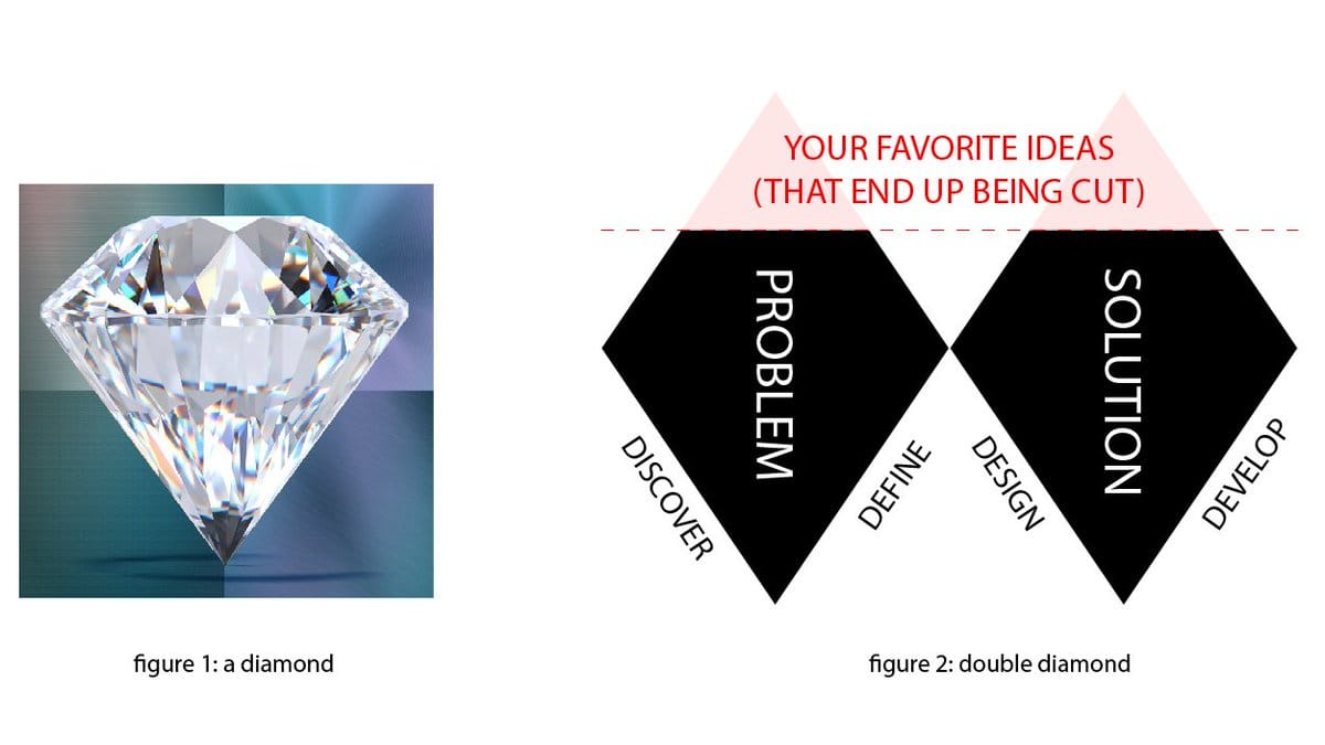
In honor of double diamond appreciation day I am once again proposing that we call the double rhombus what it is, and use this more accurate representation of what a real diamond actually looks like.

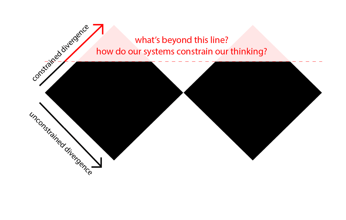
Now, this looks like a bit of a joke. But it’s, if you pardon the pun, a diamond in the rough. Because whenever you are trying to think divergently, it's crucial to actively think about the factors that constrain the extent of that thinking. Just because you are able to broadly explore some directions doesn't mean that you're seeing the whole picture.

— Pavel at the Product Picnic
